
Omoi
Omoi is a Japanese word that refers to thoughts, feelings, emotions, or sentiments. The word is commonly used to describe a person's internal experience of emotions, particularly those that are complex, nuanced, or hard to articulate.
Project
Brand Identity, Print
Client
Omoi Inc.
Year
2023
Emotional Intelligence for Techies
Omoi is a new emotional intelligence brand in Africa aimed at helping tech talents, including developers, product managers, designers, etc to enhance their emotional intelligence skills. The brand is built around the idea of "omoi" (a japanese word meaning thoughts, feeling, emotions) and it's mission is to help people understand, manage, and express their emotions in meaningful ways. Omoi can be used to describe the process of becoming more self-aware of one's own emotions and how they impact one's thoughts, behaviors, and relationships with others.
Objectives
-
To create a memorable and recognizable wordmark logo that accurately represents the brand's values and personality
-
To determine the primary colours that evoke a sense of growth, positivity, and sophistication
-
Develop a visual identity that is modern, clean, bold and professional and full of energy.
The Omoi Clan
The Omoi Clan is a community of people who believe that emotional intelligence is just as important as technical expertise. At Omoi, we believe that our ability to understand and manage our emotions, as well as those of others, is critical for creating a more compassionate, collaborative, and fulfilling work environment in the tech industry.
We are committed to bringing the knowledge and practice of Emotional Intelligence to the forefront of conversations among tech stakeholders across Africa.

The Process
Research: We conducted research on the emotional intelligence industry, competitors, and target audience to gain insights into the brand's positioning and personality.
Ideation: We generated multiple ideas for the wordmark logo, focusing on typography and colour combinations. Experimented with variations of the word "Omoi" in various font styles and colours.
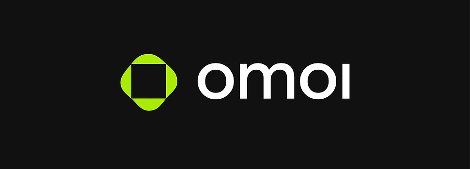
We explored the use of abstract imagery to represent the concept of "Omoi," in this case, a fluid-like shape to evoke a sense of emotional complexity and nuance while creating a sense of balance in the centre.
In other words, we could say that the brand helps give a sense of control to our audiences’ emotional complexities. The typeface was chosen for its readability and versatility, making it suitable for use across all branding materials.
Refinement: We refined the logo choice based on feedback from stakeholders and the target audience, making adjustments to typography, colour, and overall composition.


The Colours
As a premium brand having ‘wellness’ at its core, the brand's primary colours are lemon green and black. Chosen for their contrast and their ability to evoke different emotions. Lemon green is a bright, energizing colour that represents growth, creativity, and optimism. Black, on the other hand, is a grounding and stabilizing colour that represents focus, control, and sophistication.
The lemon-green colour stands out against the black background, evoking feelings of energy and growth. The contrast between the two colours creates a sense of balance, which is representative of the brand's focus on emotional balance.


Typography
Typography: Select a modern, sans-serif font for the wordmark, with clean lines and a professional feel. The font was chosen for its readability and versatility, making it suitable for use across all branding materials.

Final Result
The logo is simple, memorable, and easily recognizable, making it an effective visual representation of the brand. The colour palette and typography were used consistently across all brand touchpoints, including the website, business cards, and conference materials etc. This created a cohesive and recognizable visual identity for Omoi, reinforcing its brand positioning and personality.
At the launch of Omoi, the brand identity was generally accepted and described as "excellent" by the intended audience which led to an in-flux in registrations such that the exclusive, limited slots for registrants into the community were filled up on the launch day with tonnes of people on the waitlist.
When asked why they were eager to be a part of the community, about 70% said they were first drawn in by the brand design and then sold by the problem the community aims to solve.