Housepadi
HousePadi is the modern property management solution whose mission is to empower landlords to manage their rental properties seamlessly and tenants to enjoy a stress-free renting experience.
It strives to achieve this by providing an intuitive platform that streamlines communication, payments, and maintenance requests.
Project Type
Brand Strategy, Identity Design
Client
Housepadi
Year
2023

The Brand Goal
The brand promises to make property management as easy as a walk in the park. It commits to providing a platform that simplifies tasks, fosters trust, and enhances communication, ultimately making the lives of landlords and tenants more comfortable and hassle-free.
To achieve this, there was the need to develop a brand identity system that uniquely differentiates and seals the brand’s position in the market in terms of expressing the right visuals and clear message to the target customers. We created an image that feels simple, accessible, reliable and collaborative, making sure the user experience is prioritized.
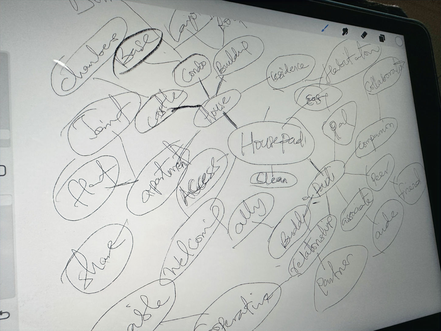
Creative Direction
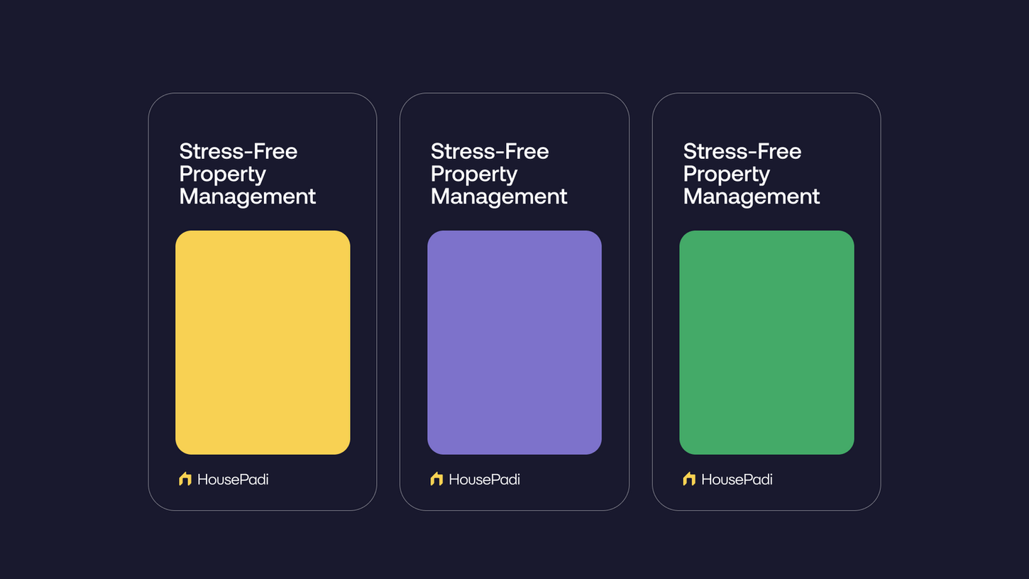
For the direction, a simple, modern, and minimal solution was developed with cool and calming colours, a mix of stylish and sans-serif typography contrast in size/hierarchy, and also subtle textures and patterns that add depth and a tactile feel to the designs. High-quality uncluttered imagery of modern apartments and users also best embodies the brand's personality.
This balanced colour palette creates a unique and memorable brand identity, ensuring that HousePadi stands out as a trustworthy and dynamic solution in the property management industry.
The Logo
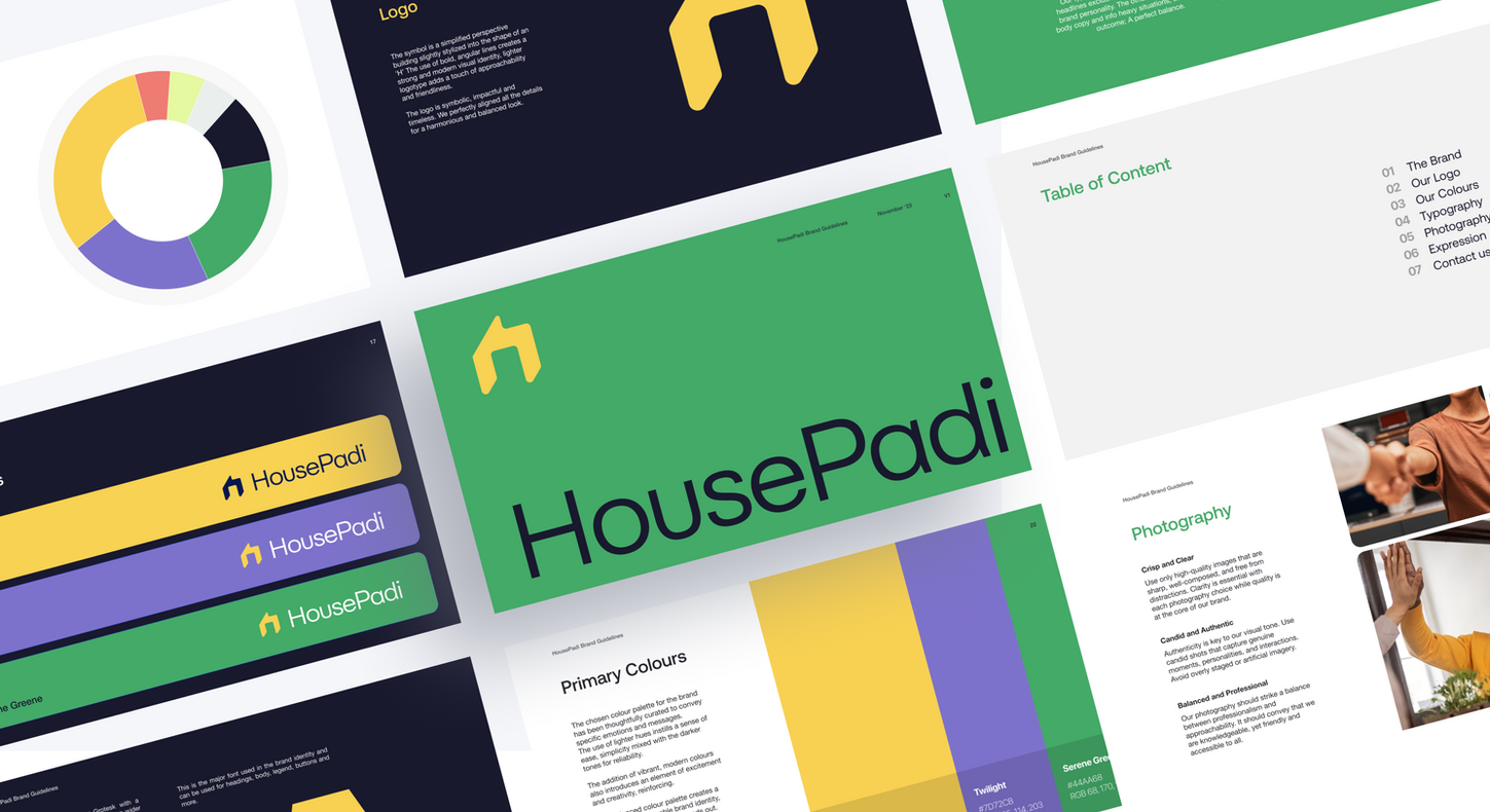
The symbol is a simplified perspective building slightly stylized into the shape of an 'H’ The use of bold, angular lines creates a strong and modern visual identity, lighter logotype adds a touch of approachability and friendliness. The logo is symbolic, impactful, and timeless. We perfectly aligned all the details for a harmonious and balanced look.


Colours and Typography
The chosen colour palette for the brand has been thoughtfully curated to convey specific emotions and messages. The use of lighter hues instills a sense of ease, and simplicity mixed with the darker tones for reliability. These colours are commonly associated with security and growth. The addition of vibrant, modern colours also introduces an element of excitement and creativity, reinforcing. The accents add a touch of enthusiasm to the brand while maintaining a sense of professionalism and approachability.
This balanced colour palette creates a unique and memorable brand identity, ensuring that HousePadi stands out as a trustworthy and dynamic solution in the property management industry.

Application
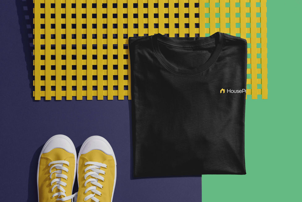
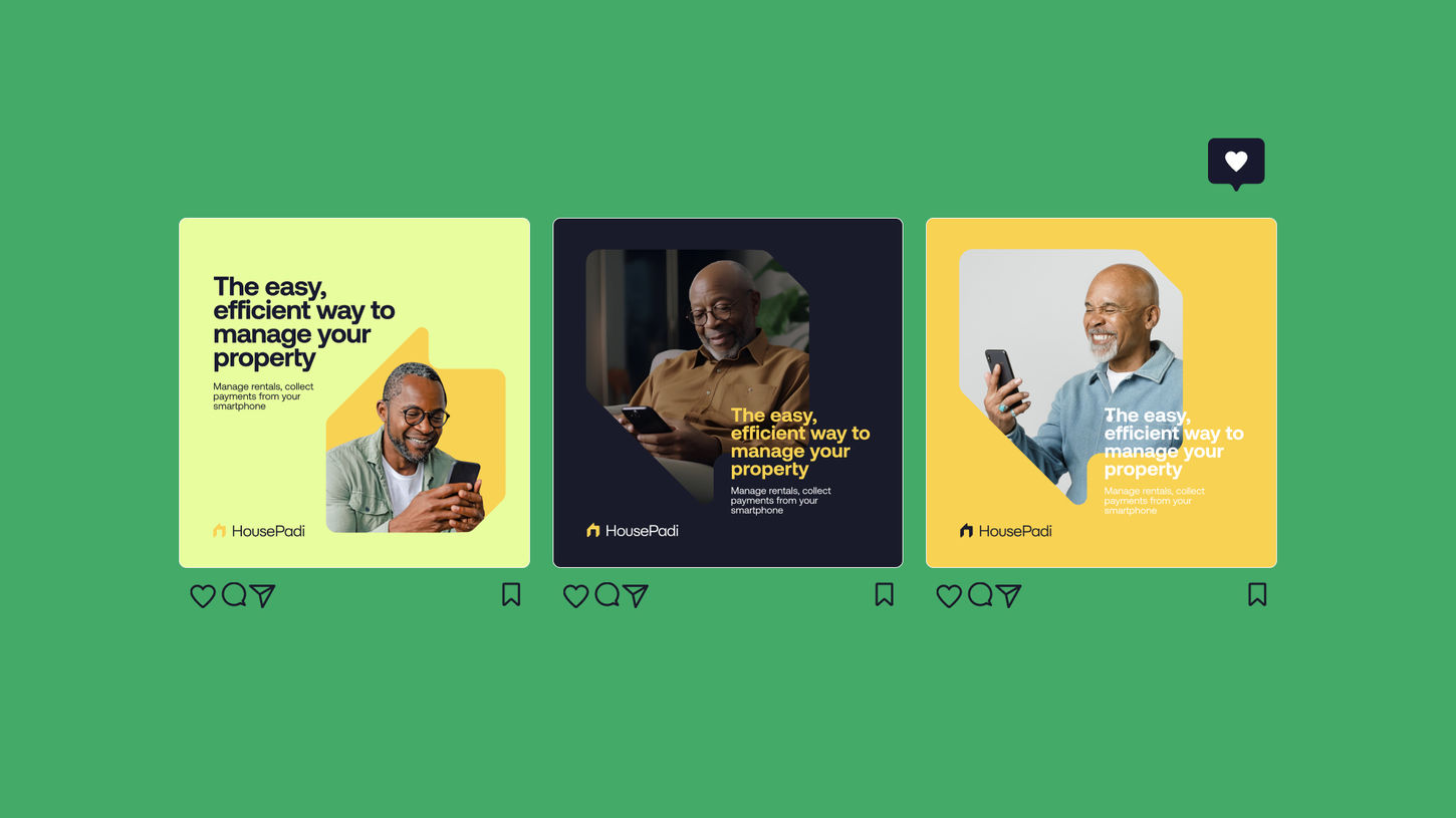
The identity system is used across a variety of mediums, including posters, flyers, banners, social media, and the product website. The wordmark and visual elements are used consistently throughout these materials, ensuring a strong and consistent brand presence.

Touchpoints
At the completion of the project, the intended audience accepted the brand. In only a week, there had been 300+ people joining the waitlist and In less than 3 months, the library had enjoyed over 5,000 downloads on Figma.
Reactions were over the roof and the the brand got these milestones 1 week away from launch. So many customers applauded the brand and design system.
Conclusion
At the completion of the project, the intended audience accepted the brand. In only a week, there had been 300+ people joining the waitlist and In less than 3 months, the library had enjoyed over 5,000 downloads on Figma.
Reactions were over the roof and the the brand got these milestones 1 week away from launch. So many customers applauded the brand and design system.


